Binary Systems Diagrams
Phase diagrams of binary mixtures are extremely important to understand the phase behaviour of mixtures, make predictions and evaluate models.
In yaeos the GPEC algorithm has been partially implemented. This algorithm allows the efficient calculation of phase diagrams for binary mixtures.
Warning: This implementation is still a working in progress and due to several changes in the future. Revisions and opinions are also welcomed!
[1]:
import yaeos
import matplotlib.pyplot as plt
import numpy as np
Global Phase Equilibria Diagram (GPED)
In yaeos the \(GPED\) of a binary mixture is easy to generate. First, we define the model (EoS) that we want to use. Once the model is defined we use the object GPEC that receives as argument the defined model.
First we define the mixture that we are going to study, we will use the binary mixture of \(CO_2\) and \(nC_4\).
[2]:
# Pure compounds properties
Tc = np.array([304.2, 425.1])      # critical temperature of CO2 and n-butane [K]
Pc = np.array([73.8, 38.0])        # critical pressure of CO2 and n-butane [bar]
w =  np.array([0.2236, 0.200164])  # acentric factor of CO2 and n-butane [-]
Once we have defined our system, we define the model to use. For this case we will use the PengRobinson78 Equation of State, with the classical quadratic mixing rules using a constant \(k_{ij}=0.1\) and \(l_{ij}=0\)
[3]:
kij = np.zeros((2, 2))       # binary interaction parameter matrix
kij[0, 1] = kij[1, 0] = 0.1  # CO2-n-butane

mixrule = yaeos.QMR(kij=kij, lij=0*kij)

model = yaeos.PengRobinson78(Tc, Pc, w, mixrule)
Once we have everything defined. We just instantiate a GPEC object like follows.
[4]:
gpec = yaeos.GPEC(model)
Plotting diagrams
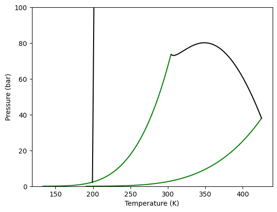
We can now plot the different kind of phase diagrams calculated for a binary mixture. Starting with the global phase equilibrium diagram, we use the method plot_gped.
Here we can see how to do it, and the resulting diagram, where it is possible to see the vapor pressure lines for each pure component and two critical lines. One corresponding to the LV equilibrium line, that goes from one pure component critical point to the other and a LL equilibrium line. This second line starts from high pressure and ends at a lower critical end point.
[5]:
gpec.plot_gped()

plt.ylim(0, 100)
plt.show()
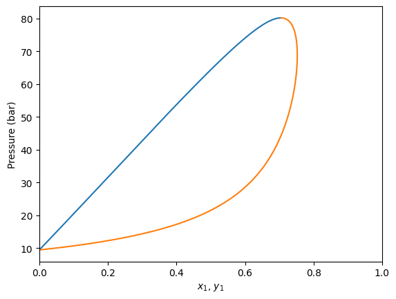
Plotting isotherms (Pxy diagrams)
It is also possible to calculate \(Pxy\) diagrams, just specifying the temperature. This is done with the plot_pxy method, which plots the phase diagram and outputs the calculated values too.
[6]:
gpec.plot_pxy(temperature=350)

plt.xlim(0, 1)
[6]:
(0.0, 1.0)
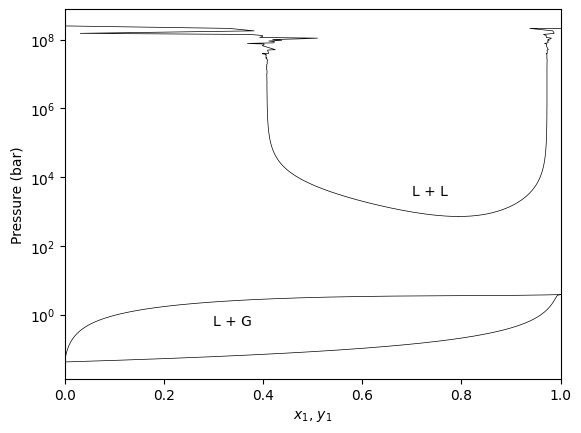
Pxy regions with LL equilibria
The GPEC algorithm will detect if the Liquid-Liquid critical line exists at the specified temperature and will calculate the corresponding LL region.
[7]:
gpec.plot_pxy(temperature=210, color="black", linewidth=0.5)
plt.yscale('log')
plt.yscale('log')

plt.annotate("L + G", xy=(0.2, 1.), xytext=(0.3, 1))
plt.annotate("L + L", xy=(0.7, 3000), xytext=(0.7, 3000))
plt.xlim(0, 1)
plt.show()
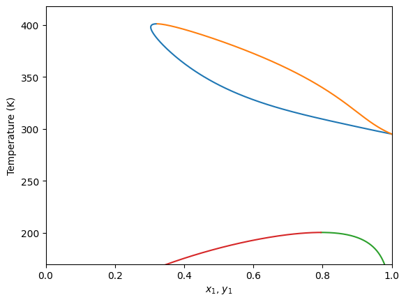
Plot isobaric (Txy) diagrams
It is also possible to calculate isobaric diagrams. This is done in a similar way that isothermic ones, but in this case we use the plot_txy method. This method receives the specified pressure for this.
[8]:
gpec.plot_txy(pressure=60.0)
plt.ylim(170, None)
plt.xlim(0, 1)
[8]:
(0.0, 1.0)